
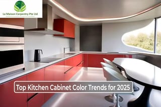
In 2026, Singaporean homeowners are decisively shifting away from clinical high-gloss white laminates toward nature-centric biophilic palettes, deeply saturated statement tones, and tactile architectural woodgrains. Modern residential configurations, specifically high-density flat configurations and open-concept condominiums. It increasingly integrate multi-textured surfaces that optimize spatial volume and enhance ambient light reflection.
Top Kitchen Cabinet Color Trends for 2026
Contemporary kitchen design matrices in Singapore prioritize structural minimalism, visual harmony, and advanced surface engineering. Strategic color selection alters human spatial perception, visually expanding compact culinary zones while engineered, climate-resilient surfaces protect custom joinery from degradation under tropical microclimates.
Biophilic & Warm Organic Neutrals
Biophilic design principles introduce balance, emotional serenity, and visual continuity to modern home interiors. When conceptualizing tailored kitchen cabinets design for HDB flat configurations, these organic tones blend perfectly with compact layouts, dark timber frameworks, and architectural under-cabinet LED strip lighting (3000K warm white).
- Architectural Walnut & Rich Browns: Deep timber tones like American Walnut, Smoked Oak, and rich Mahogany have reclaimed dominance in premium carpentry. These deeply saturated woodgrains add structural depth and tactile luxury. In modern Singaporean condominiums, premium timber laminates pair exceptionally well with matte black powder-coated architectural profiles.
- Refined Taupe & Warm Beige: Neutral tones like taupe, greige, and cashmere-beige optimize light dispersion in narrow spaces. These shades achieve peak aesthetic synergy when contrasted against premium engineered surfaces or high-end white marble countertops, establishing a highly marketable, soft-minimalist interior.
- Earthy Greens (Sage, Olive, and Emerald): Muted botanical greens introduce a soothing, nature-inspired element into high-density urban environments. Incorporating anti-fingerprint sage green laminates into a narrow 3-room HDB kitchen layout maximizes horizontal visual expansion, making compact culinary workspaces appear significantly wider and more luminous.
- Deep Burgundy & Oxblood: Burgundy serves as an elite statement tone that injects immediate warmth and upscale glamour into bespoke kitchen islands. When applied via ultra-matte laminates and accented with brushed brass or satin gold statement hardware, burgundy transforms custom joinery into a focal architectural masterpiece.
Bold Archetypes & High-Contrast Statement Tones
For avant-garde homeowners executing spatial renovations, saturated deep-tone configurations establish premium structural definition. These professional-grade color profiles command visual attention while maintaining timeless design integrity within urban apartments.
- Deep Navy & Midnight Blues: Saturated blues like midnight navy and deep indigo establish a grounding, regal presence within open-concept layouts. These dark tones pair flawlessly with premium white solid surfaces, brushed nickel fixtures, and light-toned Italian porcelain tiled flooring.
- Anti-Fingerprint Matte Black: Industrial matte black cabinetry represents the absolute pinnacle of structural minimalism and quiet luxury. Utilizing specialized thermal-healing laminates eliminates fingerprint oils, while pairings with brushed chrome, gunmetal, or architectural gold hardware deliver a clean, professional-grade aesthetic that thrives under low-lux accent lighting.
- Two-Tone Cabinetry Architecture: Modern spatial designers utilize dual-tone color blocking to create vertical contrast and distinct micro-zones. Implementing high-reflectance chalk white on upper storage units and anchoring lower base cabinets with deep navy or charcoal oak creates the illusion of higher ceilings in compact flats. This sophisticated color-blocking strategy works beautifully if you are unifying an open culinary space with a custom feature wall or TV console design in the adjacent living area.
- Desaturated Pastels: Soft pastel blues, desaturated sage, and dust pinks offer a refreshing departure from stark whites. These tones foster a casual, Scandinavian-inspired, or mid-century modern culinary environment that maximizes natural illumination from service yards.
Natural Woodgrains & Architectural Timbers
Bespoke woodgrain textures are re-emerging across premium residential developments, exhibiting deeper, richer, and more structurally mature grain patterns.
- Deep Charcoal & Smoked Timber Finishes: Premium engineered veneers in smoked oak, dark teak, and figured walnut create striking focal points when juxtaposed against crisp white architectural walls.
- Scandi-Minimalist Light Woods: Pale architectural timbers like Nordic Maple, White Ash, and light European Oak bring an airy, weightless aesthetic to compact spaces. When paired with geometric linear forms, these timbers establish an authentic, high-end Japandi or Scandinavian atmosphere.
- Timber & Neutral Fusion: Merging raw vertical woodgrain panels with flat-front cashmere or slate grey cabinetry yields an ultra-modern, texturally balanced aesthetic. Forward-thinking designers frequently isolate the central kitchen island with premium timber wrapping while wrapping surrounding storage arrays in soft, muted neutrals.
- Visible Grain Shaker Styles: Textural, visible-grain wood profiles applied to modern Shaker-style or slab-front cabinet doors deliver enduring architectural longevity that resists seasonal trend cyclicality.
Muted Pastels & Architectural Chalk Tones
Low-saturation, muted tones provide a highly sophisticated alternative to clinical neutrals, offering a calming and elite design finish.
- Premium Cashmere: Hovering elegantly between silver grey and warm beige, cashmere delivers a deeply tranquil, reflective surface texture. Cashmere matte cabinets juxtaposed against a continuous slab quartz backsplash maximize ambient light bounce within high-rise apartments.
- Dusty Lavender & Mineral Hues: Desaturated lavender adds an artistic, calculated undertone that avoids traditional color fatigue. This shade pairs exceptionally well with cool-toned grey marble or engineered stone countertops.
- Muted Botanical Sage: Neither overly dark nor aggressively vibrant, muted sage acts as a structural neutral that grounds the kitchen while adding an organic, biophilic touch.
Technical Design Engineering for Singaporean Microclimates
To maintain long-term structural integrity and protect real estate assets within Singapore’s high-humidity tropical climate, specific material engineering must accompany aesthetic choices.
- Deploy Tropical-Grade Moisture-Resistant Core Materials: Ensure all custom carpentry utilizes Moisture-Resistant High-Density Fiberboard (MR-HDF) or solid plywood cores. Surface treatments must feature premium High-Pressure Laminates (HPL) paired with seamless Acrylonitrile Butadiene Styrene (ABS) edging to prevent seam delamination caused by heavy cooking steam and ambient humidity.
- Calibrate Color Rendition via Multi-Layered Luminescent Systems: Deep navy, matte black, and warm taupe hues shift dramatically under different light sources. Integrate localized under-cabinet 4000K (neutral white) task lighting alongside dimmable 3000K ambient LED tracks to ensure dark colors retain depth without making the culinary workspace feel confined.
- Architectural Precision Hardware Integration: Synchronize all functional hardware with your chosen color profile. Pair matte black cabinetry with brushed gunmetal handles, and match deep burgundy or midnight navy arrays with solid satin brass or brushed gold pulls to elevate custom joinery into premium interior architecture.
FAQs about Kitchen Cabinet Color Trends
What is the best cabinet material to prevent warping in a humid Singapore kitchen?
The most resilient option for Singapore’s tropical humidity is Moisture-Resistant High-Density Fiberboard (MR-HDF) or solid plywood wrapped in High-Pressure Laminates (HPL). For specialized advice on optimizing compact flat layouts with these durable materials
How can I implement the 2026 two-tone cabinet trend in a small HDB kitchen?
To maximize optical depth, use high-reflectance chalk white or pale cashmere on upper cabinets and anchor the lower base units with deep tones like midnight navy or charcoal oak. This color-blocking strategy creates vertical contrast, which works exceptionally well when planning a 3-room HDB kitchen layout to make narrow spaces feel wider.
Are matte black or dark cabinet colors suitable for open-concept kitchens?
Yes, deep saturated tones like matte black and deep navy are ideal for open-concept layouts because they establish strong architectural zones.
Should color selection be the first step in a kitchen renovation?
Absolutely. Your color scheme dictates the spatial perception, material sourcing, and lighting layouts. When initiating a complete kitchen remodeling project, defining your palette early ensures seamless integration between custom cabinetry, countertops, and hardware profiles.
Confronting declining search performance requires a precise transition from generic lifestyle content to high-authority, technically rigorous interior architecture frameworks. Contact La Maison Carpentry today to collaborate with our master configuration designers and transform your residential culinary space with trend-forward, structurally engineered cabinetry.